The quantitative abilities topic in SSC preparation is as important as general awareness. Both the topics can better prepare if the candidates preparing for competitive exam do practice both in English as well as Hindi.
Heights and Distances
Basics of Height and Distance:
1. Pythagoras theorem:
(Hypotenuse) 2 = (Base) 2+ (perpendicular or Height)2
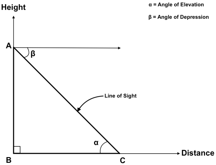
2. Anle of Elevation
The angle of elevation is the angle between the base and the line of sight. In the above diagram, it is denoted by α.
3. Angle of Depression
If the object is at point C and viewer is watching it from point A and we draw an imaginary line from point A, then the angle between imaginary line and line of sight is called as angle of depression. In the above diagram, it is denoted by β.
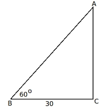
Example: If a man is standing on the ground, near the ladder which is 30meter far from the wall and the ladder is standing along the wall at the angle of 600. Find the length of the ladder?
Solution: Here Angle of elevation, α = 600
Distance of person from wall=base=30 meter
Length of ladder= Hypotenuse =?
Cos α = Base/ hypotenuse
Cos 600= 30/ length of the ladder
1/2=30/length of the ladder
Length of the ladder= 30*2
Length of the ladder= 60 meter
Histogram
Histogram is the pictorial representation of continuous data and is used to find out frequency distribution.
Construction of Histogram:
Note: The Selection of interval of data is very important. It should not be very large or very small.
Calculation of frequency distribution:
The frequency distribution is calculated on the basis of the area of a rectangle covered under a particular interval.
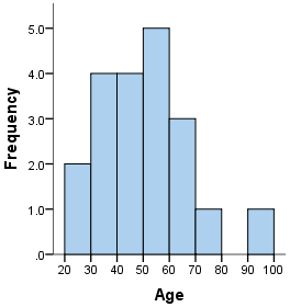
Example:
Here interval =10
X-axis shows different ages.
Y-axis shows the frequency of different age intervals.
Let us calculate the frequency distribution between 50- 60 years of age.
The value of this interval at the y-axis is 5 which gives the length of the rectangle and the base is 10.
Frequency distribution= length *breadth
= 5*10
=50
It means that there are 50 people in the range of age 50-60.
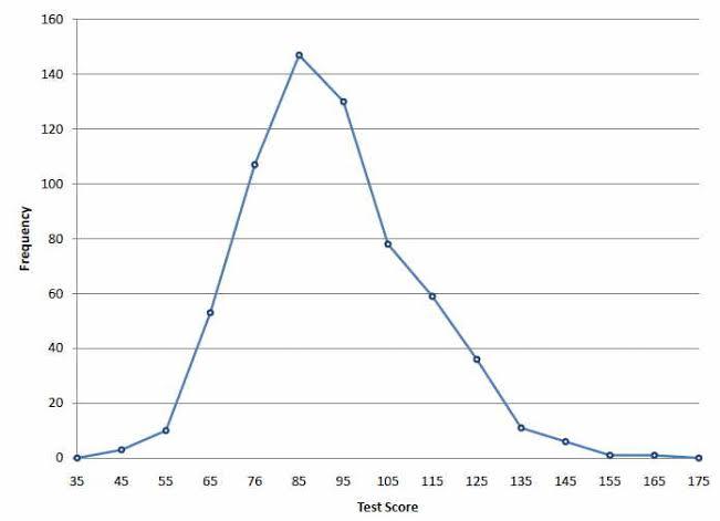
Frequency Polygon
Method to draw frequency polygon:
NOTE: The value of frequency distribution is calculated by the total area covered under frequency polygon.
All the best to All the aspirants of SSC CGL 2020 !


Supreme Court refuses to stay CAA without hearing the govt. The Supreme Court has said it won’t pass any orders to put a stay on CAA and NPR before h

1012 followers
Dear Aspirants, RRB NTPC 2020 recruitment consisting 35,208 vacancies for Non-Technical Popular categories providing a chance to the graduates

500 followers

In the current situation, many exams have either been postponed or no one knows when they will be conducted. In this pandemic, under
32 followers
केंद्रीय गृह मंत्री अमित शाह ने 23 जुलाई, 2020 को 'वृक्षारोपण अभियान' शुरू किया है. इस अभियान के तहत, कॉलोनियों, खानों और कार्यालयों में पेड़ लगाए

30 followers

Jammu and Kashmir Services Selection Board (JKSSB) has published a notification for the recruitment of Class 4 Posts. The notification is published fo

382 followers
प्रधानमंत्री नरेंद्र मोदी ने 10 जुलाई 2020 को वीडियो कॉन्फ्रेंसिंग के जरिए मध्य प्रदेश के रीवा में स्थापित 750 मेगावाट की सौर परियोजना राष्ट्र को स

13 followers
Discussing the questions that could come to your exam is very interesting. We have seen students searching for the essential questions for the exam be
1012 followers

Are you keen on stepping into the banking or financial services sector? When it comes to employment in this stable sector, one of the best jobs is

265 followers


 Copy Link